Arngren’s Website Redesign
Revitalize Your Online Presence
Arngren’s Website Redesign
Revitalize Your Online Presence
Background
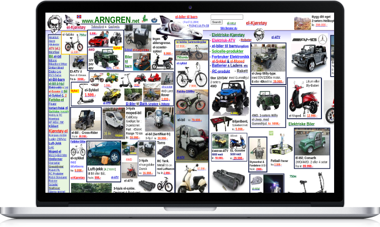
The Arngren website currently faces a multitude of design challenges that significantly compromise the user experience. Visibility issues arise from a chaotic arrangement of contents, lacking a logical structure that hinders easy navigation. Inconsistencies in design elements and formatting across pages contribute to a lack of overall coherence. Usability problems are evident, with absolute sizing leading to oversized content that fails to adapt to different screen sizes, particularly on laptops and mobile devices. The absence of a clear business description and language translation feature further detracts from clarity. The website’s look and feel suffer from a random use of colors and illegible typography, impacting overall aesthetics and readability. Additionally, the poor navigational structure and lack of adherence to a proper grid alignment compromise form and function. Most crucially, the absence of a payment portal and shopping cart functionality inhibits users from seamlessly adding desired items and completing purchases. Addressing these issues through responsive design, a consistent layout, and essential e-commerce features is imperative for an improved user experience.
Role
My role on the team was the UI/UX Designer. I worked with three other team members. I was responsible for conducting interviews and designing wireframes and high-fidelity prototypes.
User Interview
The interview was conducted to gather user feedback on the Argren.net website, focusing on users’ initial impressions, overall experience, and recommendations for enhancement.
Below were some of the questions posed:
- Can you take a look at this website (showing Argren.net) and tell me what you think it is?
- How would you describe your overall experience navigating through the Argren.net website?
- On a scale from 1 to 10, how interested are you in vehicles and vehicle parts?
- Are there any other e-commerce websites related to vehicles or vehicle parts that you frequently use?
- Any suggestions or recommendations you would give for improving the Argren.net website?
Insights
- Users displayed confusion about Argren.net’s purpose, with one thinking it was for car enthusiasts and another guessing it was a marketplace for auto parts, highlighting the website’s unclear branding and messaging.
- Despite a generally negative user experience, marked by a lack of clarity on specific offerings, users expressed dissatisfaction with Argren.net’s design and organization.
- User recommendations, driven by the perceived inadequacies of Argren.net, included a call for a clearer description of services, product details, and the implementation of essential features like customer reviews, quick search, and chat support, highlighting the urgency to address these issues to enhance user trust and convenience on the platform.
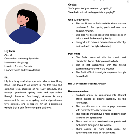
POV Statement
“Lily, a busy marketing specialist, needs a vehicle parts and toys specialist website, to purchase online and save time with her busy schedule.”
How Might We
How might we create a website for her to purchase vehicle parts and toys online easily?
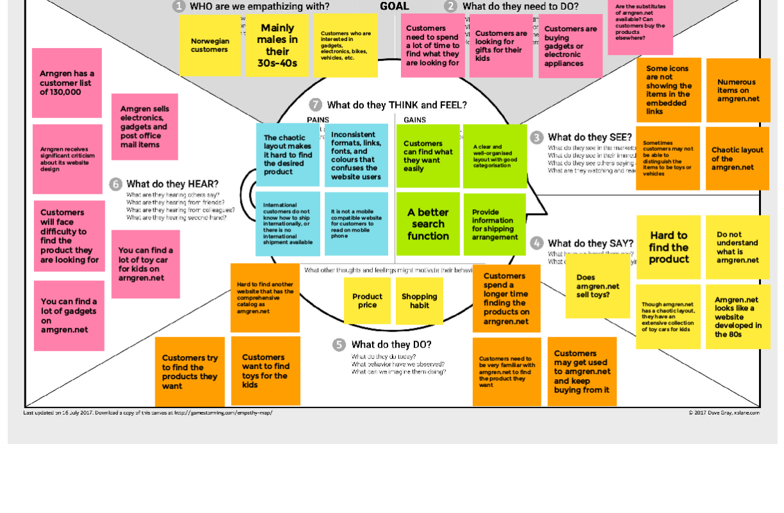
Empathy Map
User Journey Map
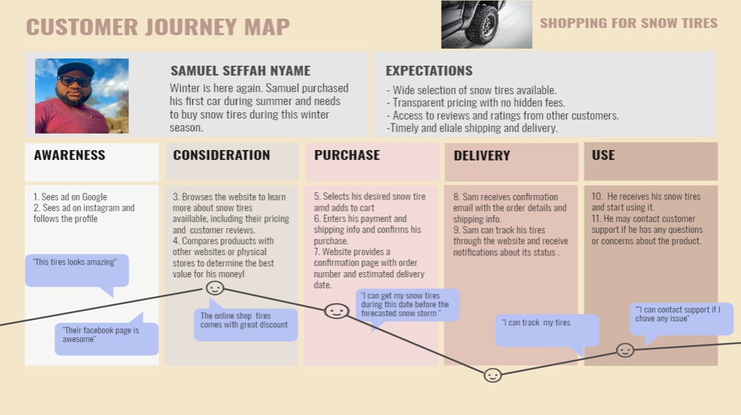
The user journey map for the Argren.net website redesign was crafted with the primary objective of comprehensively understanding and addressing user experiences. By identifying existing pain points and analyzing user behavior at various touchpoints, the map serves as a valuable tool for designers to pinpoint areas of improvement. The goal is to enhance the overall user experience by optimizing conversion paths, improving website usability, and tailoring the content strategy to meet user needs at different stages. The map aligns the redesign with business goals, ensuring that the user experience enhancements contribute to the success of the website. It provides a foundation for an iterative design process, allowing for continuous improvement based on real user experiences and feedback, ensuring that the redesigned website evolves to meet the dynamic needs of its users.
Information Architecture

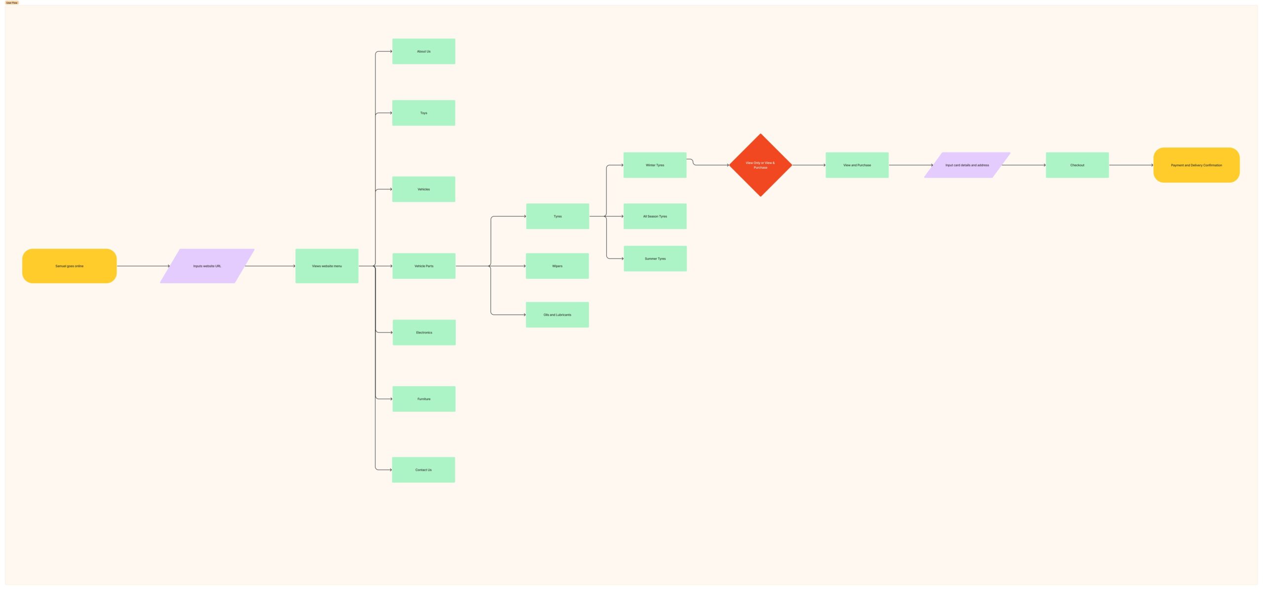
User Flows
Low Fidelity Prototypes
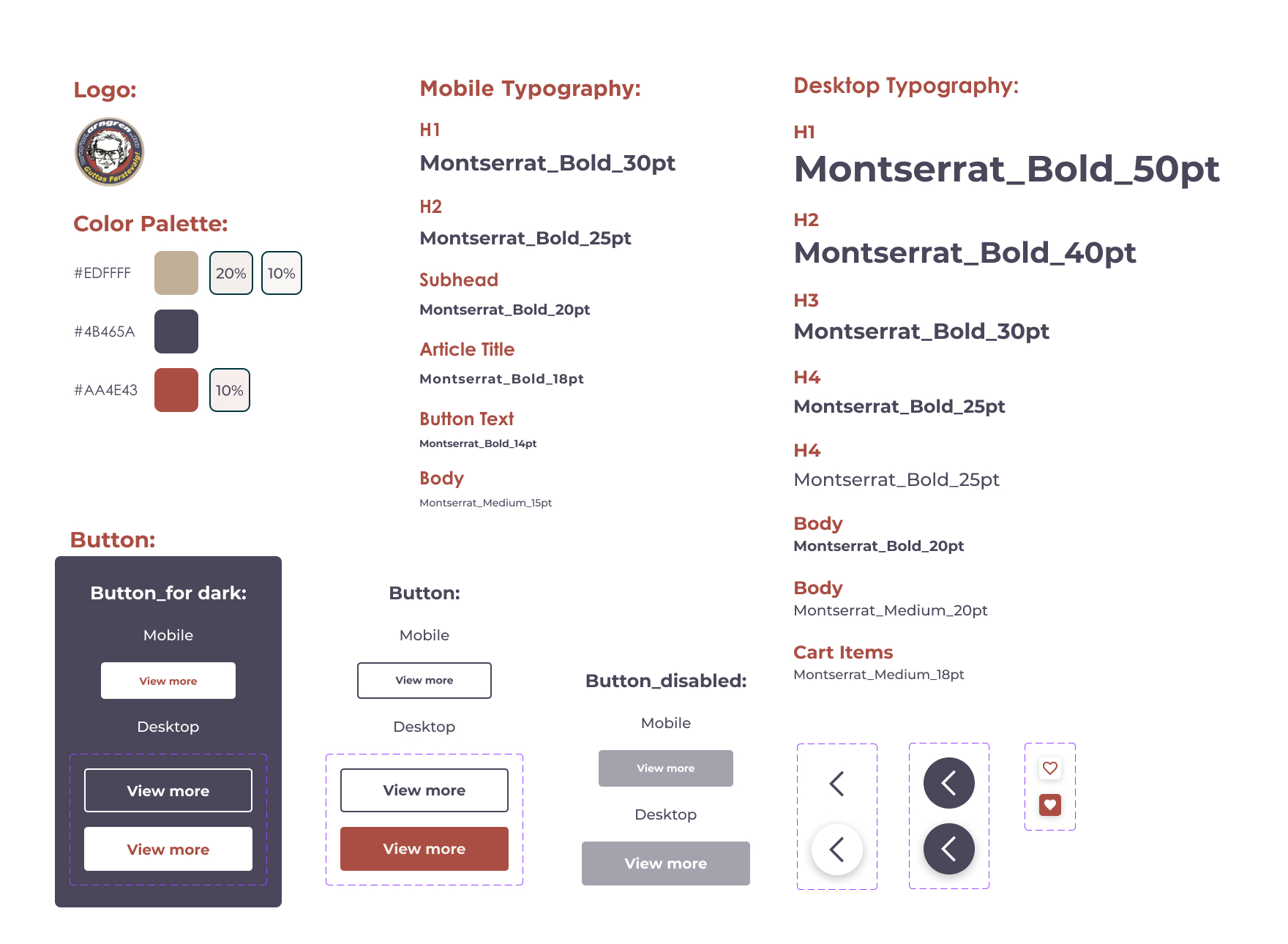
At the beginning of my design process, I created low-fidelity wireframes for testing purposes. It was useful to do this to get an overall idea of how everything would be laid out and to get feedback on the direction we intended to take since this was completely different from the existing website. Figma was used in creating these prototypes.


User Guidelines
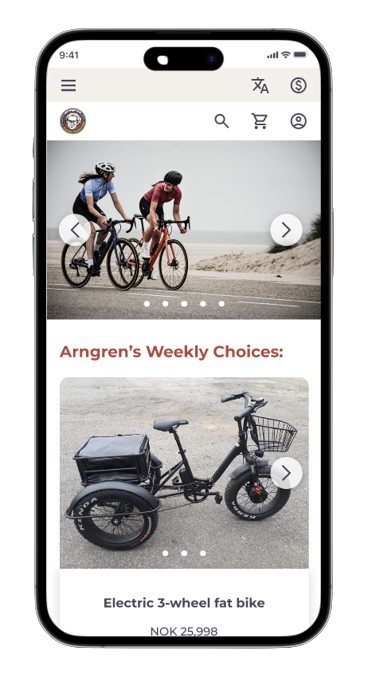
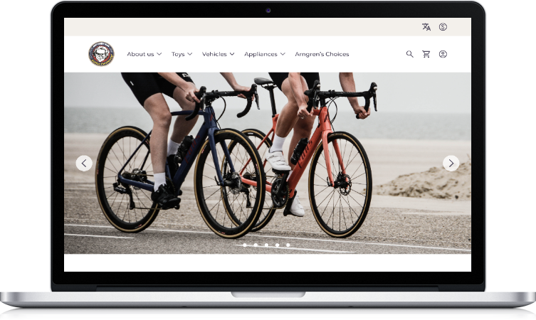
Desktop Prototype


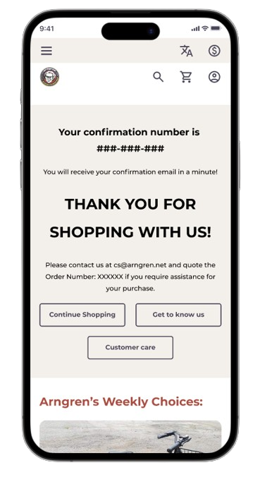
Mobile Prototype